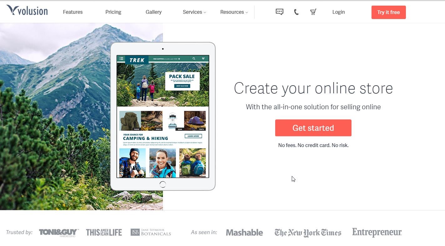
Volusion founded in 1999 is one of the oldest e-commerce platforms. Till this date Volusion powered, e-stores, worldwide have generated $21 Billion dollars.
The latest e-commerce templates are striking beauties.
But before I show you the best 5 templates, I would bring forth top 10 Volusion features. As well as why volusion is a great choice for building your ecommerce store, (without bias).
Here they are:
- Beautiful template designs. Captivate and engage visitors
Choose from the variety of captivating templates, free and premium class, for your e-store. The templates are theme based and easy-to-customize. You get one-of-its-kind storefront that you were looking for. Volusion experts customize the store the way you want.
- Easy Inventory Control. Stock count always at your fingertips
Maintain comprehensive product listing. Add images, video and more whenever you want. The inventory control tools help you keep the stock levels at your finger tip. Even if you miss for a reason or what do not worry the alerts never let you run of stock.
- In-built marketing tools. Attract more shoppers.
Fire daily deals, emails and discount offers from your admin panel. Use inbuilt SEO tools to optimize the content. Use Social Media tools to share your content and drive viral traffic to your store.
- Innovative and unlimited product display. Impress your buyers
Use tools like vZoom, Lightbox and color swatch to showcase your product in the way. Display your merchandise like a world-class retailer. Stop, engage and impress buyers in the track. Speed up the buying decision.
- Web Responsive. Stay connected 24X7, across all devices
The native iOS, Android and smartwatch apps keep you connected with your store, on the move. View real-time sales order and inventory level. Update product catalog, connect with the customers and do more- anytime, anywhere.
- Quick Order processing and Easy (but secure) payment. Orders keep rolling in.
Offer trusted payment options like PayPal, Google Wallet and major Credit cards. Over 50+ options available. Ease up payment and speed up the checkout process.
The quick inventory update and trusted shipping options speed up order processing. Order management is as smooth as a hot knife through butter.
- Leverage e-commerce giants. Convert more.
Your Volusion store is in sync with giants like Amazon and eBay and Facebook. Reach out to more shoppers there and entice them to your storefront. Bring home useful traffic and convert more.
- Practice personalized email outreach program. Drive home repeat purchases
Shoot personalized emails and newsletter from the admin. Promote new products and offer irresistible discounts. Share important updates and award loyalty bonus to catalyze repeat purchases.
- Offer enticing daily deals and discount coupons. Turn more visitors into buyers.
Surprise visitors with irresistible “deal of the day” and discount coupons. Lure in visitors and convert more of them into buyers.
- Rock Solid Security. Shoppers shop in peace.
Your Volusion store is PCI certified and has 128-bit-encryption Secure Socket Layer (SSL).
Your customers' data is safe behind the impregnable fortress wall of the data center. Your data always remain secure under the sharp vigil of Volusion' security experts.
The shoppers shop in peace.
Clearview adds style to a contemporary look to your website. The easy-to-find navigation links on header take the visitors where they want to go.
The full-width header image magnifies your brand. A streamlined presence right there on the home page.
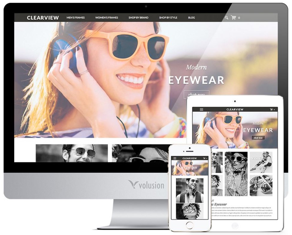
Features:
- Web responsive
- Home page image size – Large 1200px x 525px, Medium 800px x 350px
- Photo area below the Main image: Size: 320px x 300px
- Social media links in the footer area
- Navigation links in the header area above the main image
- About us area (enter description text) about company
- Company phone and email below
Dapper is the perfect template to project a strong brand personality on the home page. It thrives on the concept of minimalist color and bold typography.
There is a prominent space to showcase the featured products. They catch the attention of the visitors at the first instance.
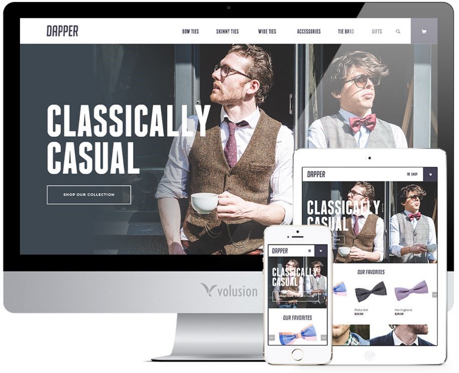
Features:
- Web responsive
- Homage page image size – XLarge: 1400px x 750px, Large: 1140px x 611px, Medium: 1024px x 622px, Small: 320px x 295px
- Photo area below Main image: 4 high resolution product images of at least 700px x 700px
- Social media buttons and site map in the footer.
Driven template has a powerful color scheme and precise typography.
Highlight the star product categories and catch the attention of visitors. Impress them at the first instance, right on the home page.
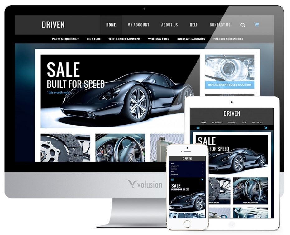
Features:
- Web responsive
- Home Page Main Image : in size of 322 px x 293 px, 470px x 395 px, 854 px x 395 px.
- Vertical Photo Area ( left side of Main image) : 2 images of size of 322px x 183 px, 220 px x 183px, 266px x 183.
- Horizontal photo Area (below the Main Image): 4 images of dimensions: 322px x 274 px, 346px x 274 px, 266px x 274 px.
- About Company: The description text area below the photo area
- Footer links : The phone number, business hours and email of the company
- Social Media : Any three social media links you want. By default, the template has Facebook, Twitter, and Pinterest.
The Royal template gives a clean , uncluttered look to your home page. The accent colors and a clean view of the vital information are the highlights. The side bar navigation bar is the perfect place to put your categories. Visitors visit in a fly the categories pages from the home page. Navigation is smooth and quick.
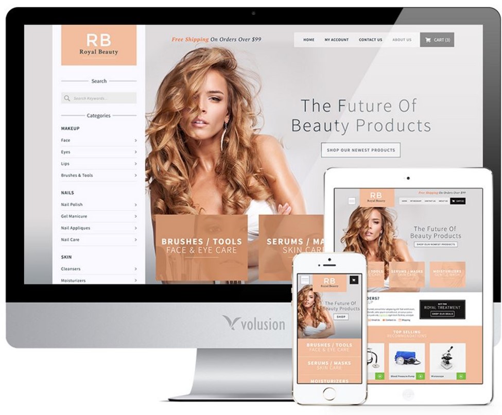
Features:
- Web responsive
- Main Homepage Image : Size for Desktop : 1000px x 583px , 1300px x 758px
Size for Mobile: 320px x 336px, 765px x 758px
Size for Tablet: 992px x 491px. - Photo Area : 3 images of size 522 px x 376px.
- Recommended Product Photo Area: Images of products 524px x 429px
- Video Area: Video screenshot of size 746px x 391px
- Contact Info : Provide company address, phone number, and email
- Social Media: Links of Facebook and Twitter ( or any three of your choice)
- Footer links: The site map
Silo has a full-width image that takes up the greater part of the home page. The minimal interference from the header makes the main image prominent. It captures the attention and is ideal for strong brand projection.
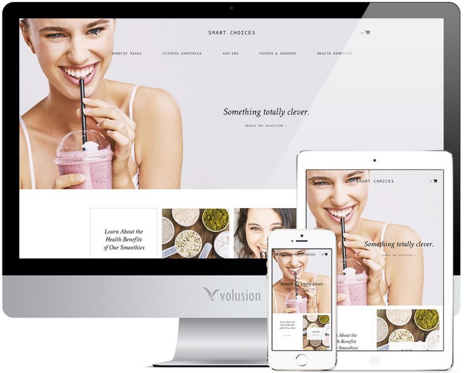
Features:
- Web responsive
- Main Home Page Image: Size for Desktop – 1800px x 700px
Size for Tablet – 720 px x 720 px
Size for Mobile – 640px x 720 px - Photo Area: 3 images of size 330px x 485px
- Text Box: A headline linked to the content page
- Newsletter Box: Sign up the newsletter from there
- Wide Promo Area: Image of size 1200px x 440 px with a title and sub-title.
- Footer links
- Social Media : Links of Facebook, Twitter, and Pinterest
Take advantage of rich customizable Volusion templates and build a powerful store. Leverage rich functionalities, striking-beautiful front end, and robust features to drive in more sales.